Did you know that a brand identity can have more than one logo? In fact, having multiple versions of your logo can not only uplevel your brand but it also keeps it consistent across all platforms and collateral.
Having various logos gives your branding flexibility, allowing the different styles to work in different ways. For example, you have a horizontal logo which is ideal for your website, however having a stacked version works much better for your social media channels.
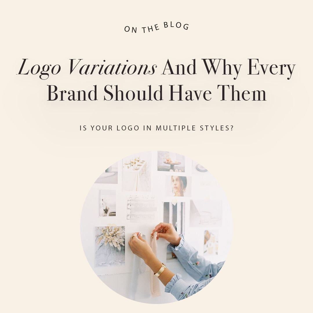
In this blog, I’m going over the most common logo variations, what they are and how best to use them.
First up, what even is a ‘logo variation’?
A logo variation is basically just your primary logo that has be re-designed into different format. The point of this is that your variations are still recognisable and fit to your branding but give you options to use throughout your content and marketing materials.
Why is it important to have multiple versions of your logo?
You may think that one main logo will do the trick. Unfortunately, if you want to be consistent with your brand and look the good doing it, you need to have various logo styles to ensure it works in various situations. This is not a one size fits all. Be prepared to use your logo online, on social media, business cards, brochures, packaging – one style logo just won’t work the same on these – you need to have choice.
Here are the logo variations you should have in your brand suite and how they should be used:
Primary Logo
Your primary logo is you go to. It’s the one you’ll use most of the time. This is your main logo you’ll use on your website header and brand collateral. Your primary logo should include your full business name.
Secondary Logo
Your secondary logo tends to be your primary logo that’s been rearranged into another orientation. For example, if your primary logo is horizontal, your secondary logo could be a stacked version. It’s helpful to have a secondary logo which is in a different orientation as allows you to use it in places that your horizontal logo may not fit. Secondary logo are often used in places such as social media or print materials.
Submark(s)
Your submark is a simplified version of your logo. There are no rules to this but a submark might include your business name or it could be just the initials used in your primary logo.
Submarks are great for social media profiles, branding photography, on your website or in your email footer. They are also great to use in concept presentations, workbooks, freebies, templates or webinar slides so that you work is consistently branded and people are reminded that it’s your work.
Illustrations and icons
If your primary logo includes an illustration/icon, it’s also useful to pull this out and use it on its own as a brand element. These are my favourite! Illustrations are an amazing way to create patterns that you can use on packaging, your website, social media, business cards or other marketing materials. An icon is a subtle way to add branding to a graphic that will already be seen in context with your full primary logo, for example an Instagram post or story graphic.
I hope this has been helpful to you. My branding packages cover all these logo variations, so please enquire here or email daisy@daisycreative.org for more information.